Clients
 Processes
 Blog
Blog


If you think QA for a good design is expensive, look at the cost of a bad design.
How often do you abandon a website with sheer frustration and vow never to return? How long does it take for a website to confuse you with scattered information? and how many times has your web page crashed at the most inconvenient moment? We’ve all been there – questioning our life choices and the caliber of UX designers behind these websites.
Good user experience has emerged as the single biggest factor behind successful apps in the last decade. With the outburst of tech startups post-digitalization wave, the technical side of building an app is now a tried-and-tested recipe. The real challenge on the face of aspiring startups is to ensure a flawless user experience for lasting positive impressions.
For any app to achieve such a user experience, there are several hiccups to get rid of first. App owners consider these as minor annoyances that won’t prove bothersome for users. (FYI: They will)
This is where Quality Assurance steps in. So
- How does QA refine the quality of a User Experience?
- How does QA differentiate between good and bad user experience?
- And most importantly, should your business hire QA engineers to level up your UX?
There is one way to find out. Join us as we dissect the UX into the most potent errors and deep dive to understand why you should hire expert qa engineers and fix these errors to create a seamless UX.
Usability Errors
(Discoverability, Navigation, UI Standards)
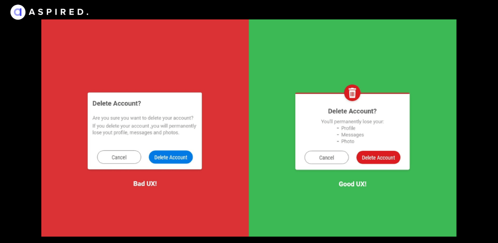
Usability means “ease of use,” in terms of UX, it is “the ease with which your user achieves their purpose to visit your website.” If you invest all your resources in developing and promoting a high-quality website yet ignore the usability testing part, you might put all your efforts at risk.
Here are a few examples for you to better understand the usability part:
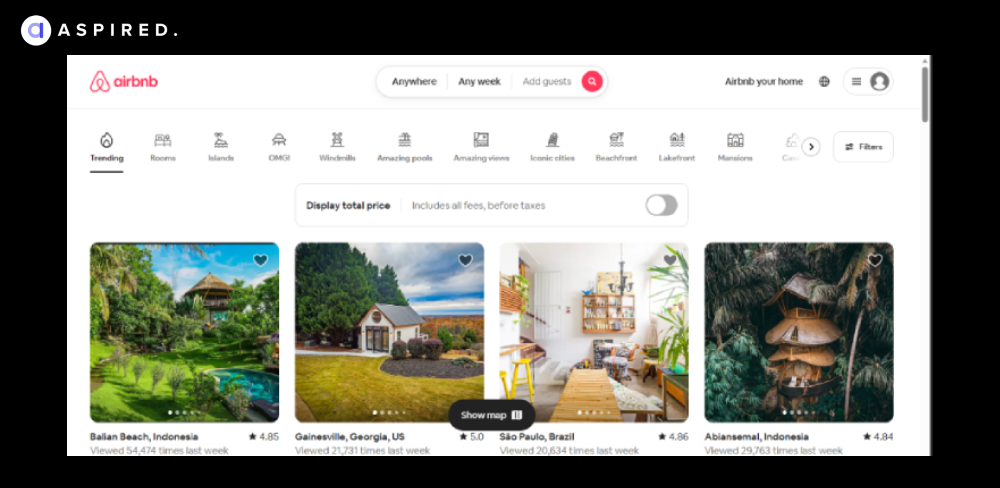
The Airbnb landing page offers an intuitive and comprehensive way to view your desired destinations and book accommodation.

Can you properly read all the submenus on this Zara webpage? We bet you can’t. This happens when you overdo a simplistic design and ruin its usability.
QA Insight
When usability errors arrive, QA engineers step in with heuristic evaluations and usability testing to get rid of these errors by harnessing tools like InVision and Sketch; QA experts prototype designs, spot gaps, and direct UX designers to create intuitive experiences.
“Around 70 percent of digital businesses that fail do so due to Poor Usability.”
Functional Errors
(Bugs, Glitches, Unresponsiveness)
Most people will confuse functionality with usability. Functionality is determined by how your app/website can help meet the client's ultimate goals, while usability focuses on how effectively and comfortably it does.
Usually, the functionality should be slightly prioritized over aesthetics. A great-looking product is essential, but the UX will suffer if it doesn’t work as good as it looks.
Let’s start with a few examples.
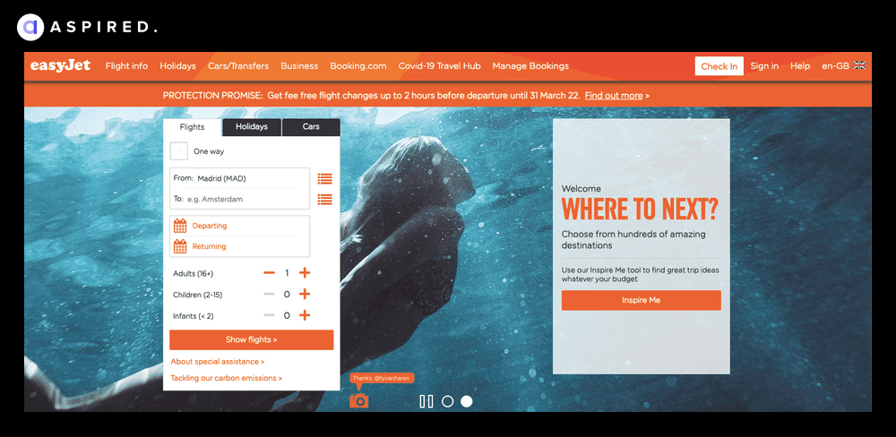
Take EasyJet’s homepage: the overall design is eye-catching, but the functionality leaves much to be desired. With the “Where To Next?” section taking just the same space as the booking form, busy top menu, and excessive pop-ups – there’s too much going on here.
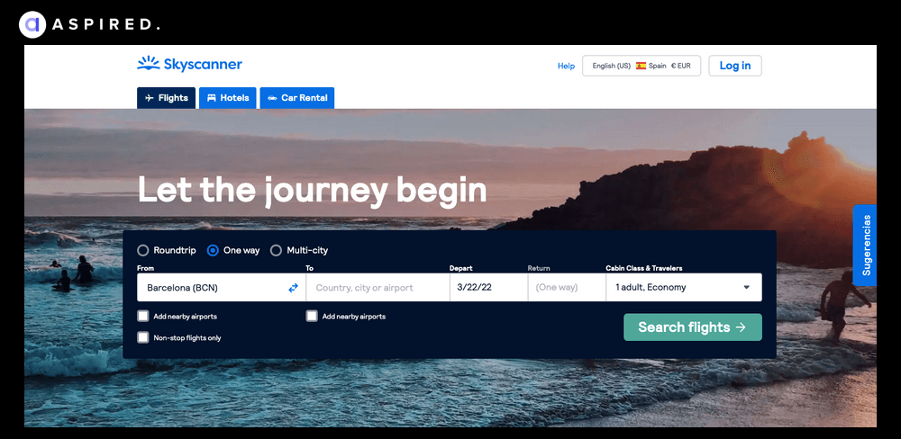
Skyscanner’s homepage gets straight to the point and focuses on the essentials. Their design is straightforward and focuses on what site visitors want to do: make a booking. They get the win here.
QA Insight:
Functional errors are a trust-breaker. When you hire qa testing developer/team, they fix them by performing unit tests, working seamless integration, and applying regression testing protocols to iron out discrepancies for a seamless user experience.
Accessibility Errors
(Incompatibility, Lack of Alternative Text, Poor Color Contrast)
Usability issues prevent certain users from accessing, understanding, and interacting with the environment due to their age, limitations, or ability level. As a UX designer, it is essential to build empathy and endorse accessibility requirements as a set of design constraints to create a better product for all.
Here are the examples:

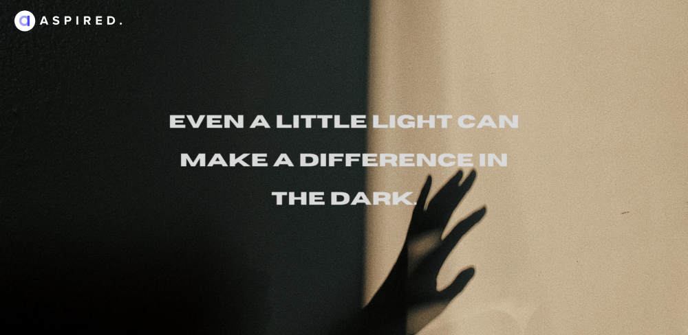
The above picture is an example of a bad accessible design. It uses a dark font on an even darker background, so the text isn’t easy to read.
The above picture is an example of good accessibility as it uses clear color contrast to make the content readable.
There could be multiple ways to make your app’s interfaces accessible to everyone. The best practices include:
- Conducting a web availability review to uncover and test potent issues with real users.
- Maintaining a web accessibility checklist and testing all designs regularly
- Designing in low-contrast environments and using browsers designed for visually impaired users.
QA Insight:
When you hire web QA engineers to fix the accessibility of your UX, they implement WCAD guidelines by performing contract checks and employing tools like AXE to identify accessibility gaps. UI design teams continue from there on.
“Think in systems. Don’t think about your design as a stand-alone, but rather as part of a bigger journey and conversation that your users navigate through.”
Performance Errors
(Slow loading, Lag, Unresponsive Interactions)
According to a study by Google, 53% of mobile users abandon a website if it takes more than three seconds to load. This signifies the importance of performance-related UX errors, as slow-loading websites can substantially lose potential customers and revenue.
Other performance errors in UX can include:
- High response time: Delays in the system's response to user interactions.
- Rendering issues: When elements or content on the screen take too long to load.
- Memory exhaustion: The system utilizes excessive memory resources, leading to slowdowns, crashes, or unresponsive behavior.
QA Insight:
Using tools like Google’s PageSpeed and LoadRunner, QA experts improve the speed of your pages, perform rigorous load testing, and probe weaknesses in the page. The development teams then fix identified hiccups and ensure a swift product experience.
Content Errors
(Inaccurate Information, Outdated Content, Inconsistent Messaging)
Content is the King in 2023 (and for any foreseeable future). The significance of credible, reliable, and quality content has only increased in the last few years.
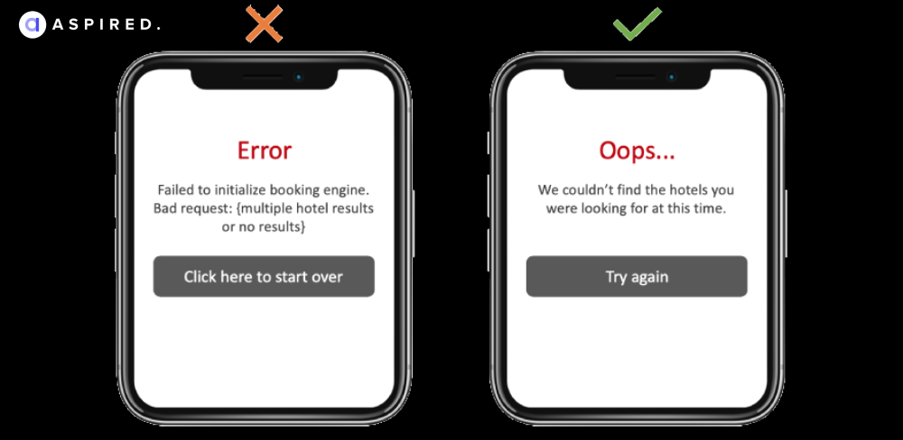
The focus of your content should be on the consumer and not on the search engine. Here is an example of how you can improve regular error pop-ups to something more user-centric:
The best practices ask you to:
- Use keywords across all your content
- Pay attention to quality
- Double-check the authenticity
- Write appealing and engaging content
- Revise old content to keep it fresh and relevant
Make sure your content uses your brand’s voice and tone. It should provide interesting, valuable information to your customers.
QA Insight:
Here is a question; do you hire QA engineers afresh to fix content issues or replace your existing copywriters for better? Well, errors of any type, if they slip through, are the responsibility of QA. So in such cases, QA engineers go through the content and ensure no broken links, unclear information, and compromisable content makes it through.
“The impact of UX is crystal clear: the more satisfied your users are, the more likely they are to do whatever it is you are encouraging.”
Consistency Errors
(Visual Coherence, Harmony, Familiarity)
Consistency is the key. Lack of pattern-forming consistency inhibits recall and recognition and could result in other usability issues (e.g., affordance, extra cognitive load).
Examples: Page design that looks different on different pages; inconsistent formatting of text; too many unique layouts.
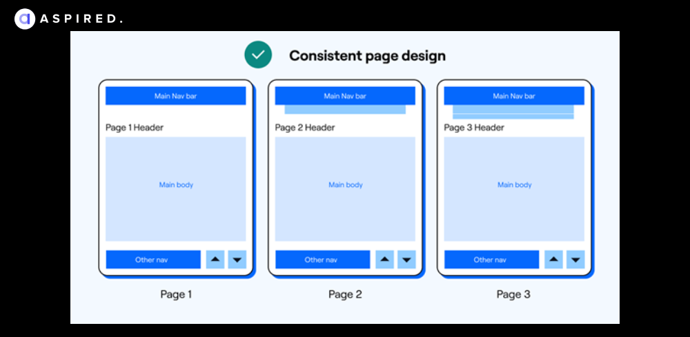
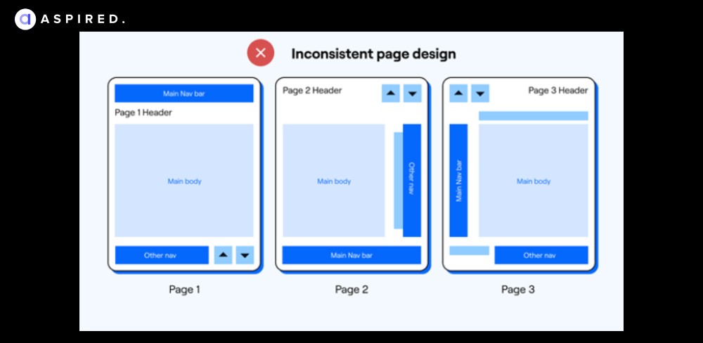
QA Insight:
QA/testing engineers limit a web page's unique elements and templates. They test the app across devices and browsers and use tools like BrowserStack for the complete picture. Designers must rely on pattern libraries, style guides, and design language systems to create reusable, uniform, and consistent experiences.
Feedback Errors
(Lack of Feedback, Unclear Error Messages, Absence of Confirmation)
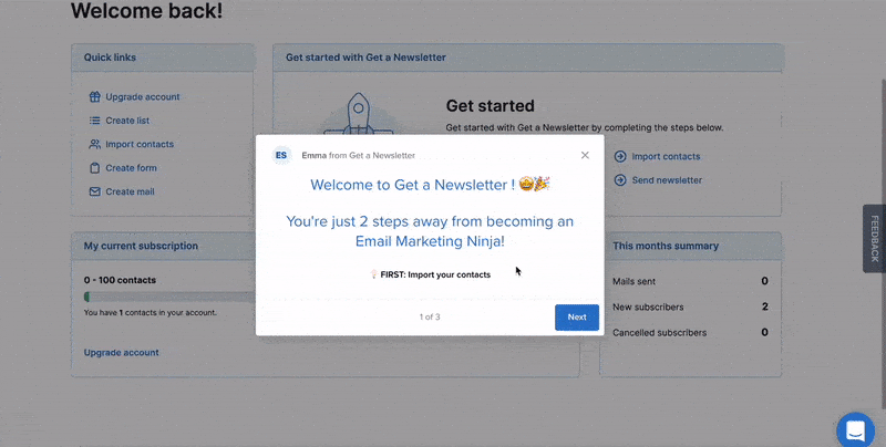
Feedback errors are an opportunity for websites to be creative, playful and guide their users in a sequential and intelligible manner. On the other hand, missing, confusing, or ineffective feedback on interactive elements can ruin the user journey big time.
Here is an example of inaccurate feedback where getanewsletter’s “2 steps” are not actually two steps.
Here is another example of how highlighting the missing feedback from a submittal can smoothen the user experience.
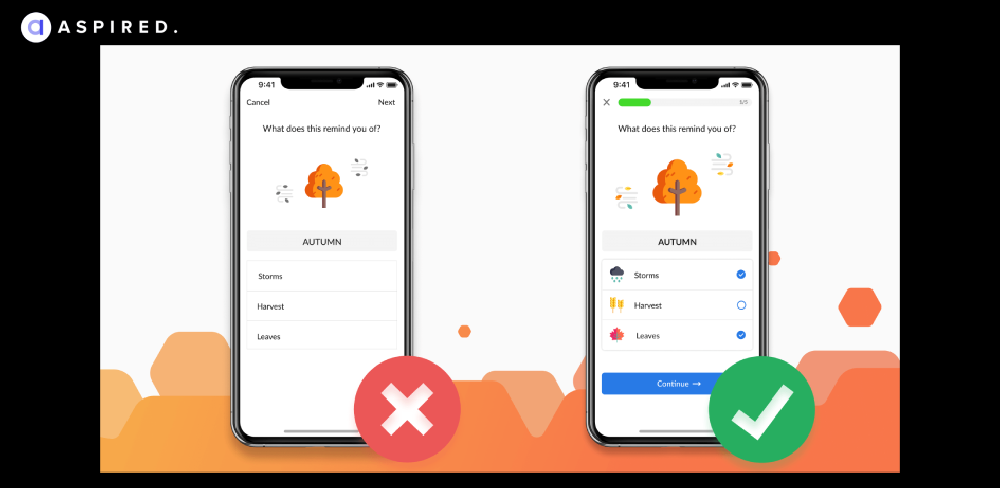
QA Insight:
QA engineers conduct UX audits to identify feedback gaps. They ensure all forms have clear and descriptive validation, error, and confirmation messages. Analyzing user surveys and timely responses ensures the user journey is kept at the forefront.
Elevate Your UX Game with Expert QA
Robust Quality Assurance is inevitable for creating a seamless user experience and easy interface navigation. From testing usability and functionality to identifying and resolving issues, the QA teams are instrumental in refining and improving the user experience to achieve its pinnacle.
If you are looking to hire QA engineers for your software development projects but don’t want to settle for the ordinary, Aspired has got your back. Aspired’s robust quality assurance frameworks, paired with its Design Review Committee (DRC) and a team of dedicated, ethical hackers, ensure your product is safer, faster, and exceeds all expectations.
Pair up with Aspired, hire remote QA engineers today, and align yourself with top-notch, pre-vetted talent within 48 hours!